Rainbow Blight (Part 1 of 4)
Division as unity, darkness as light.
It’s been a awhile since I’ve done a series. This will be a brief one. I’m racing to publish all three four parts while it’s still June, and “Pride” still lingers in the air like a sulfurous fart.
Wish me luck.
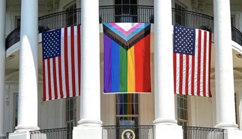
A lot of hay has been made about the recent appearance of the rainbow flag at the White House “Pride” shindig/stripper convention. Flanked on either side by a pair of boring old Stars & Stripes, its proud and prominent display symbolized… well, something.
Perhaps “victory” would be the best word. A conqueror’s banner, flown atop the enemy castle after a long, bloody but ultimately successful siege. The White House is now the Rainbow House, complete with victims of cruel medical experiments that would leave Josef Mengele drooling with Envy:

But it was also transformed into the Blight House, because manmade rainbows are fucking ugly. They are loud, stupid, attention-stealing eyesores. Crimes against beauty and art.
I think that’s a point often skipped over, in discussions about the symbolic rainbow’s history and use. Yes, it was the ancient icon of the cults of Ishtar and Manzat, with all the attendant tyranny, androgyny, perversion and murder that implies. Yes, it is rooted deeply in occult practices and secret societies, stretching back hundreds if not thousands of years. And, yes, it is also featured in Genesis, as a sign of the covenant between God and all living things.
How can this be?
What does the theft and corruption of God’s life covenant mean, when we place it in the context of the our current Clown Dimension and its sycophants?
In this series, I will argue that it could’ve been no other way. The symbol was destined for a worldwide resurgence, the fundamental ugliness of which we’ve been conditioned to accept as “beautiful” for our entire lives.
But first, let’s talk about light and color.
Deconstructing Light
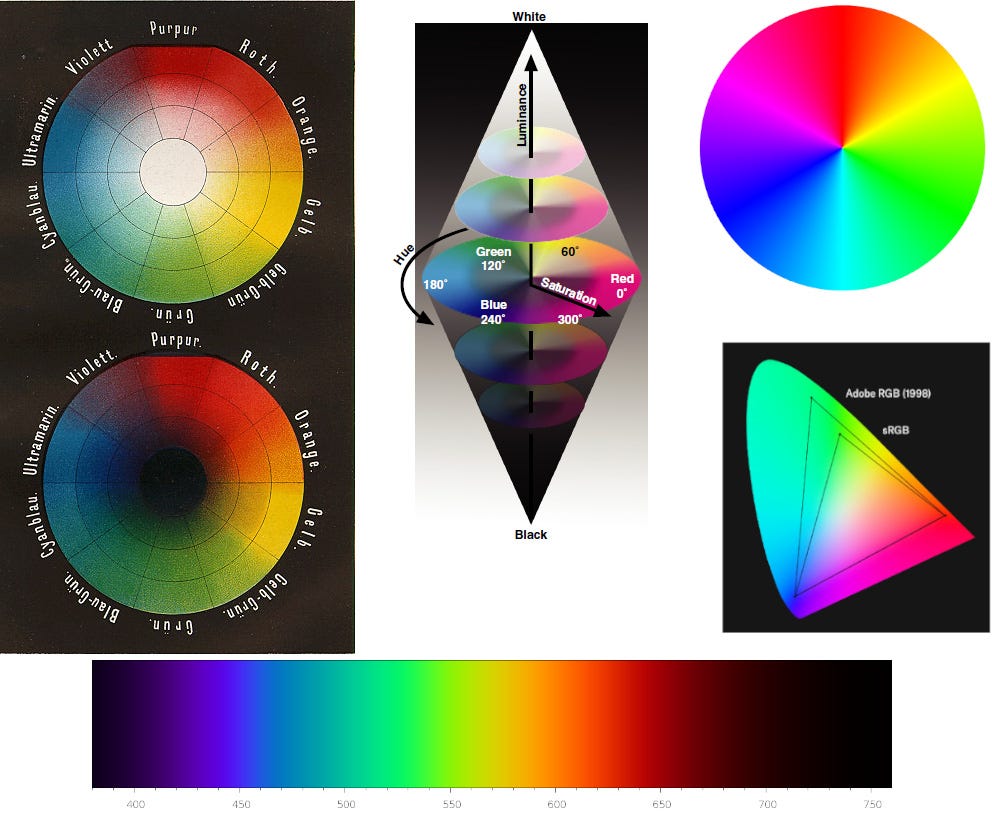
I’ll resist the urge to turn this into some grand treatise on color theory. Suffice it to say that I have professional experience in the science of color and its usage in visual design. I’m versed in all the major color models and how they’re applied across different mediums, including the screen-based mediums of generated light.
To sum it up: you aren’t going to use the same model to tweak a video’s color grading that you’ll use picking out paints at Benjamin Moore. That’s why different naming conventions and models are applied. There have even been attempts to create and market a unified meta-model that translates between mediums (but from what I’ve seen, they’ve all been about as successful as any Grand Unified Theory of Physics so far).
But one thing all modern color models share in common is that they are gradients. Whether you’re dealing with hue, saturation or brightness, a smooth transition exists between any two nodes on the spectrum. Color can also be triangulated or curved from multiple nodes, to form any number of gradient shifts.
Some might look at these models and say:
“Hey waitaminute, Mark! Ain’t those rainbows?”
Yes and no. What we’re looking at are representations of the visible light spectrum, which itself is a subset of the electromagnetic spectrum. Colored light is pure white light that’s been split into constituent parts. By nature, each fragment that branches off the splitter node is dimmer than the united whole. However, since the human eye perceives brightness logarithmically within certain ranges, a splintered shard of color may be interpreted as equally “bright” as the white, unbroken form. That’s why prismatic lighting was popular before the widespread use of electric light. By splitting and distributing sunlight across a volume, it created the illusion of a more well-lit environment.
Prismatic light is deconstruction and division in its simplest visual form. It’s the pulling apart of the elemental substance of Creation. We encounter it both in nature and via synthetic, manmade tools and models. It is both actual and experiential, a mental product of what our limited sensory organs can receive. There are more “colors” that we can’t “see” but which nevertheless exist according to our current understanding of physical reality.
And so in looking at a rainbow, we are seeing only a part of the true picture of reality. What we are shown is an exploded portrait of division at the most fundamental level, and the illusion of dimmed, disintegrated wavelengths as bright light.
The Poisoned Palette
In that sense, color models are similar to the rainbow’s illusion, conveying only that segment of the EM spectrum that we can see and interpret with the naked eye, and which registers as undimmed light up close. They are constructed for a variety of purposes, including among them visual design.
If we’re trying to achieve an aesthetically pleasing image, breaking the light into its components is only the first step in the process. As always, designers use the model to isolate and blend colors in various percentages, which will eventually form our palettes. We then apply our colors in various complementary ways, often referring to those palettes and patterns we find pleasing in Nature.
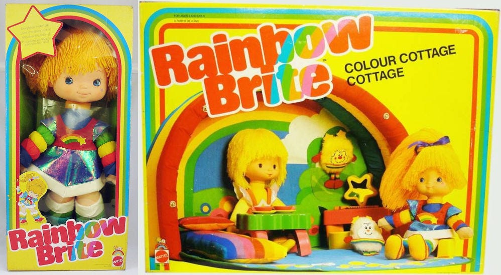
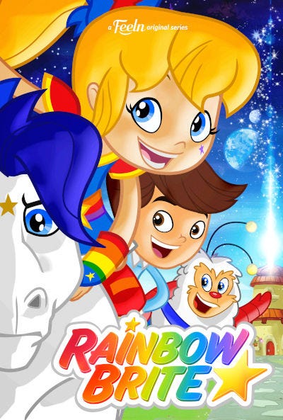
But the medium still matters. When designing an image on a computer monitor that’s meant to be reproduced on physical materials, the process still requires the so-called “eyeball test.” This sometimes translates into multiple grueling rounds of review with a printer or manufacturer, in order to ensure that the final production colors match the ones approved on the screen, and that they’re perceived more or less the same across all mediums. But they will never line up one-to-one. The image of Rainbow Brite printed on the box will never exactly match the colors painted on the doll, or the dyes on its clothing.
I’ll have more to say about Ms. Brite and her fellow travelers in future parts. For now take a good, hard look at the image above. Not merely the doll, but the entire aesthetic on display. What words would you choose to describe it?
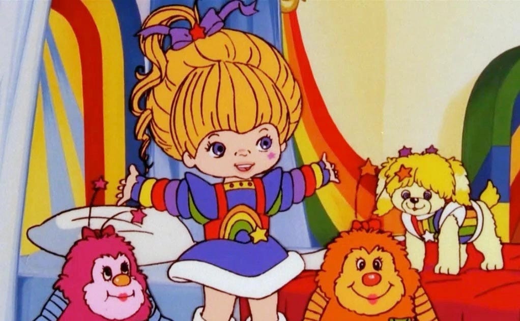
Here’s the character in 1980’s cartoon/toy-commercial form:
And again in her aborted 2014 incarnation, rendered in the unlovely (and dirt cheap) CalArts style:
What words spring to mind?
If you said something along the lines of “garish,” “gaudy,” “mismatched,” “tacky” or even “nauseating,” you’re on the right track. Clowns have traditionally employed a similar anti-aesthetic of chaotic, clashing colors and patterns, in order to further mark themselves as figures of ridicule. Only an idiot would dress that way in public. Either that, or someone who’s acting very strategically.
That’s because before such a garish display draws our ridicule, it must first draw our attention. Which it absolutely does, because emanating from all those clashing colors and shapes is Nature’s ancient language of poison.
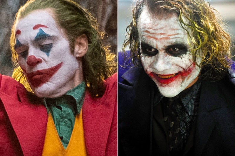
With this property of deadly colorings in mind, it stands to reason why clowns are manifestations of both comedy and horror. In fact, it seems like their horrific properties have gained such a foothold in American culture that all the supposed “fun” has been drained from their apparance. Evil, murderous clowns dominate the box office, as observed by the fact that the role of one clown in particular secured an Oscar for two different actors, a mere eleven years apart.
At this point, I’m sure a midwit normie’s head might be exploding like the Death Star. That’s because a classic trait of midwittery is to dismiss a subject you’ve never given an ounce of thought to as unimportant. You’ve already thunk all the important thoughts, after all, and outsourced the rest to cable news and Twitter.
As such, the likely reaction will be the following:
You’re a kook, Mark.
Everybody knows that rainbows are cute and innocent and harmless. They’re popular because kids like them, and kids like them because kids like color. I think I even read some sciencey thing about that once.
Only a grouchy jackass would see anything sinister about them. You probably just hate gay people.
Whoa!
Where’d that last line come from?
After all, didn’t you just say rainbows were for kids? For pre-adolescents who like them, because they like them, because they like them?
What gives?
In the next part, I’m going to propose a different theory about the connections between rainbows and children, and the engines of postmodern evil that have been building and marketing those since before most of us were born.
I'll also be examining the meaning of God's rainbow in Genesis, and how the human version that pervades our media turns that meaning upside-down.
(Continue to Part Two)
P.S. If you found any of this valuable (and can spare any change), consider dropping a tip in the cup for ya boy. It will also grant you access to my new “Posts” section on the site, which includes some special paywalled Substack content. Thanks in advance.



I supported gay rights because this is America: freedom to decide who you are. Then at first I supported Trans rights for the same reason. Then I realized, this is just a eugenecist thing, sterilizing and disfiguring girls and making eunuchs of boys. Now I'm wondering, has pride always been about swinging your dick and ass in the face of children?
The fake and gay rainbow has only 6 stripes. A real rainbow has 7.
(Yes I know the rainbow is actually a prismatic spectrum, but the traditional convention is to represent it with 7 stripes. I actually learned a rhyme to memorize them in school. Reducing the count to 6 is akin to the French revolutionaries “resetting” the calendar to only have 10 months.)